
 Custom Certificates
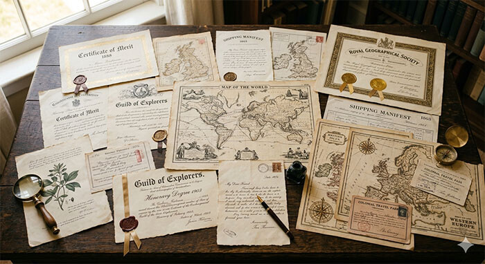
We look at paperwork every single day—from bills and receipts to digital PDFs on our phones. Because modern documentation is designed purely for utility, it is easy to forget that for centuries, printing an official document was considered an elite form of fine art.
Before digital computers and automated printing presses, creating an important credential or charter required the cooperation of master calligraphers, specialized copperplate engravers, and visual artists.
Today, we take an aesthetic journey through the history of document design, exploring how different eras achieved breathtaking vintage aesthetics and how you can use these historic design cues to inspire your next custom project.
1. The Classical Baroque Era (Intricate Complexity)
During the 17th and 18th centuries, documents were designed to display absolute authority. This was achieved through overwhelming visual complexity.
-
The Borders: Frames were filled with hand-drawn, overlapping geometric lines, acanthus leaves, allegorical figures, and cherubs. These borders weren’t just for decoration; they acted as an early form of anti-counterfeiting because they were incredibly difficult to replicate by hand.
-
The Typography: Heavy, decorative Gothic blackletter or highly ornate copperplate script dominated the page.
-
Design Inspiration: Perfect if you are creating a historical theatrical prop, a fantasy kingdom decree, or an ultra-premium heirloom family tree.
2. The Victorian and Industrial Era (The Rise of Typography)
The 19th century brought the industrial revolution, introducing mechanical printing presses and commercial typesetting. Document designers suddenly had access to dozens of different metal fonts.
-
The Style: Victorian design is famous for mixing multiple font styles on a single page. A single certificate might feature bold block letters, elegant italic cursive, and arched shadowed text all working together.
-
The Elements: This era popularized the inclusion of highly detailed vignettes—small, engraved illustrations of locomotives, factories, or classical blind justice scales integrated into the header.
-
Design Inspiration: Ideal for mid-to-late 1800s film props, retro business certificates, or vintage-style gag gifts.
3. The Mid-Century Modern and Minimalist Era (Clean Authority)
By the mid-20th century, the design world shifted toward the philosophy of “less is more.” Complex borders and mixed fonts were replaced by structure, symmetry, and white space.
-
The Style: Utilizing clean, crisp geometric borders, structured grid layouts, and highly legible serif fonts like Baskerville or Times New Roman. Authority was conveyed through clean spacing and high-quality materials rather than busy decorations.
-
Design Inspiration: The definitive choice for modern office displays, professional replacement keepsakes, and clean corporate recognition awards.
Bring History to Your Workspace
Understanding the art of print allows you to choose a style that perfectly matches the mood of your project. Whether you love the dramatic flair of the 1700s or the sharp, professional look of the 21使用st century, the layout sets the tone.
At DocuReplicas, our master designers study these historical layout frameworks to ensure that whatever era or style you choose, your custom document layout looks completely authentic, beautifully balanced, and historically accurate.
👉 Find Your Inspiration. Explore Custom Layout Styles at DocuReplicas!