 xunaawen@outlook.com
  WhatsApp:+86 13698446041
 Custom Certificates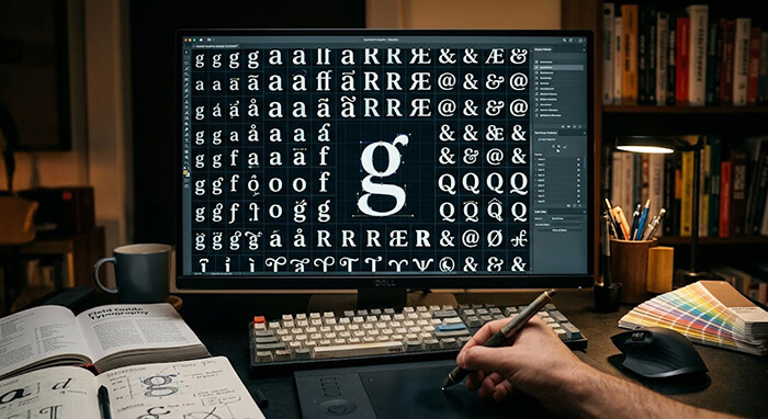
Most people don’t think twice about the fonts they see on a daily basis. We read emails in Arial, view websites in Helvetica, and read printouts in Times New Roman. These modern digital fonts are designed for one purpose: rapid legibility on a backlit smartphone screen.
But if you are attempting to create a flawless, high-fidelity document replica, using standard computer fonts is a fatal mistake.
In the world of professional replica craftsmanship, typography is everything. If a font is off by even a fraction of a millimeter, or if a design uses a font that didn’t exist when the original document was created, the entire project fails the test of authenticity. Here is an inside look at how master designers hunt down and utilize rare fonts to build works of art.
1. Avoiding the Anachronism Trap (The Timeline Matters)
In historical graphic design, using a font from the wrong era is called an anachronism. It is the ultimate giveaway of a cheap, careless print.
For example, many budget novelty websites use a font called Monotype Corsiva or basic Comic Sans for everything because they come pre-installed on every Windows computer. But if you are trying to replicate an official document from the 1800s, using a font designed in the 1990s looks completely wrong to the human eye.
A true professional matches the font to the precise decade of the project:
-
Pre-1800s: Demands irregular, hand-carved woodblock or copperplate typefaces where individual letters feature unique, artistic imperfections.
-
Late 1800s: Requires bold, high-contrast slab-serifs or heavily stylized geometric fonts popularized by industrial steam-press printers.
2. The Hunt for Rare Digital Font Restorations
Many of the most beautiful fonts used on historical certificates, military commissions, and artistic charters were never turned into modern computer files. They only exist as physical lead metal blocks locked away in old print shop cellars, or pressed into crumbling museum archives.
To achieve total accuracy, our team engages in extensive font sourcing:
-
We work with specialized typographic historians who manually scan old physical documents at ultra-high resolutions.
-
We use vector tracing software to trace the outline of every single capital letter, lowercase letter, punctuation mark, and flourish.
-
We manually recreate the spacing rules (kerning) to match the exact rhythm of vintage print layouts.
Physical Lead Type Blocks -> High-Res Scan -> Vector Anchor Points -> Fully Restored Digital Font
3. Crisp Vector Scaling vs. Pixelated Blurriness
Have you ever tried to enlarge a small picture or low-quality scan of a document on your home computer? The letters instantly become blurry, pixelated, and jagged along the edges.
True typography accuracy requires using fully digital vector typefaces. Vector paths are mathematical formulas, not pixels. This means whether we print a tiny piece of text on a pocket-sized security credential or scale a majestic header up onto a massive framed wall charter, the lines remain perfectly crisp, razor-sharp, and visually stunning under a magnifying glass.
Every Character Has Character
At DocuReplicas, we don’t settle for the basic fonts installed on a standard office laptop. We maintain a curated, deeply researched private library of hundreds of historical typefaces, rare digital font restorations, and official script patterns to ensure your project looks completely genuine.
👉 Demand Typography Excellence. Start Your Order with DocuReplicas Today!
🔗 How to Link These New Posts (Internal Linking Network):
-
Link Day 9 Post 1 to Day 2 Post 2: Inside Day 9: Post 1 (Cosplay/Reenactment), under section 1 (Costume Competition), link the words
"prop master"or"high-precision novelty documents"directly to Day 2: Post 2 (Movie and Theater Props) so costume builders can read about how Hollywood studios handle prop documents. -
Link Day 9 Post 2 to Day 6 Post 2: Inside Day 9: Post 2 (Interior Design), under section 3 (Grid Gallery Wall), where it talks about matching frames and archival mats, link the words
"archival mats"straight to Day 6: Post 2 (Collector’s Preservation Guide) so home decorators know how to avoid acid burn stains on their art. -
Link Day 10 Post 1 to Day 6 Post 1: Inside Day 10: Post 1 (Typography), under section 1 (Anachronism Trap), look at where it describes pre-1800s copperplate layouts. Hyperlink the words
"historical print layouts"or"antique fonts"straight back to Day 6: Post 1 (Beautiful Document Designs) to give readers a full visual breakdown of historical design eras.